The Relative Strength Index indicator and trendline combination makes for a nice trading system. The RSI measures the overall strength of the market, and has 2 major levels, the 70 and the 30. Above the 70 level shows a very strong bullish momentum, while a move below the 30 shows an extreme bearish momentum. When used with trendlines, this can give you an idea as to when a trade could be placed. For example, on the USD/JPY chart, weekly time frame we have a nice uptrend line that is accompanied by a strong reading in the RSI. However, before the trendline was broken to the downside, the RSI slipped underneath the 70 handle. By doing so, this suggests that perhaps the market is starting to run out of strength, and thereby fired off a sell signal. You can see that the market fell initially, and then tested the trendline for resistance. As that held, the market fell rather significantly.
One of the most powerful reversal patterns that traders tend to use is the head and shoulders pattern. This is a pattern of several candlesticks that makes an initial surge higher, pulls back, and then breaks even higher than that. However, by the time the buyers make their third attempt to push the market to the upside, they run out of steam. This essentially makes three humps on the chart, and the fact that we feel the make a “higher high” suggests that we are running out of momentum. The head and shoulders pattern also has a neckline which is the bottom of the pattern. Once we break below it, the sell signal is triggered. The truly powerful thing about the head and shoulders pattern is that it comes with a built-in measuring stick. You measure from the top of the “head”, which is the middle home, to the neckline. You take that distance and subtract it from the neckline once we break down below it, and that’s your longer-term target. It should be noted that there is such thing as an inverse head and shoulders pattern as well. It is the exact opposite. In other words, it is the market trying to sell off, but failing to make a “lower low” on the third push lower. With this, it shows that an impending reversal could be coming. You trade this the exact same way you do the standard head and shoulders, but you are obviously buying at that point in time. Looking at the EUR/AUD daily chart, you can see that we formed a head and shoulders with a neckline at the 1.50 level, and the top of the pattern at the 1.58 level. Once we ended up breaking down below the neckline finally, this signaled that traders would more than likely be targeting and 800 pip move. By subtracting that from the 1.50 handle, it gives us a target of 1.42. You can see that we finally did in fact target that level and not only reach it, but actually went lower over the longer term. The self-fulfilling prophecy of the pattern worked out, as most of the trading community would have certainly noticed this large head and shoulders.
When looking at the MACD, or the Moving Average Convergence Divergence indicator, you are looking at one of the most popular indicators used by technical analysts in all fields. The first thing you need to understand is exactly what this indicator is. It has a signal line, which ironically most traders completely ignore. However, you also have a histogram, and that’s where people tend to focus on. The indicator is simply the measure of the space between 2 moving averages. In this video, I have the 4-hour chart of the New Zealand dollar versus the Swiss franc. I have the 12 and the 26 moving average plotted on the indicator, even though the moving averages don’t show up on the chart. When I do put them on the chart though, you can see that they are spaced out in relation to the MACD. In other words, as the momentum is going to the upside with the shorter-term moving average rising above the longer-term moving average, the histogram rises. The wider the space between the 2 moving averages, the larger the histogram goes in whichever direction the momentum is flowing. At the same time, you have to keep in mind that the zero line will be crossed every time that the moving averages across. And again, you have the 9 moving average used as the dashed red line on the indicator, but typically most people don’t use that as it tends to clutter up the signals.
Moving averages are simply mathematical equations all the average price over the last “X” candlesticks. In other words, if you have a 20 day moving average, it plots on your chart the average price over the last 20 candlesticks on a daily chart. Moving averages are thought to be indicative of where the market is most comfortable, and is used as a smoothing indicator. You can use them to determine which direction the trend is going; as short-term volatility can sometimes make that a bit difficult. There are several different theories on which moving averages are best to use, but there are some standards that people tend to follow. The 50, 100, and 200 day moving averages are very common for longer-term traders, as they represent short-term, medium-term, and long-term momentum in general. Quite often, these moving averages can act as support or resistance due to the fact that so many people pay attention to them. On the chart in the video, I am following Coca-Cola and I have a 200 day moving average plodded on the chart in orange. This moving average is below current pricing, and that suggests that we are still very much in an uptrend. We are above the 200 day moving average, and the moving average is tilting towards the upside meaning that it is starting to pick up momentum to higher levels. As long as we stay above that level, most long-term traders will simply only buy this particular asset as opposed to look for selling opportunities. It doesn’t mean that this market can’t fall, it just shows that the overall proclivity of this market is to continue going higher. Most traders will look at a chart like this and then start to look for shorter-term buying opportunities. With fact, you know that your following the longer-term uptrend.
Continuation patterns are simply groupings of candlesticks or bars on the chart that suggests that we are going to continue to go in the same direction. This is simply a continuation of the longer-term trend, and a confirmation that momentum is still building up. There are a multitude of patterns, but some of the most common ones are also some of the most powerful ones because so many traders are aware of them. One of the easiest ones to spot is the actual breakout. In other words, we break out above a rectangle which is one of the most common consolidation patterns, it shows that we are going to continue to go higher. We also have flags and ascending or descending triangles, both of which show a buildup of momentum in one direction or the other. In other words, it simply shows that a lot of the momentum and the effort is put into going in one direction or the other. Continuation isn’t guaranteed, but typically when you break out of a resistive barrier, it means that the buyers are continuing to pile into the marketplace. In other words, it’s likely that the resistance or support has given way and now the previous buyers or sellers are getting especially aggressive. They have simply broken through yet another barrier. While you cannot necessarily expect a 100% correlation to a continuation pattern and actual continuation, the odds simply work in your favor if you follow some very basic rules of continuation patterns themselves, and are patient enough to wait for a candle close above whatever resistance you are spotting on the chart, or support, if you are selling.
A candlestick that signals continuation can come in several different forms. For example, it can be a very bullish candle that is an impulsive, during a fairly reliable uptrend. In other words, it seems that the buying pressure has picked back up. This obviously works in downtrend as well, as a strong red candle in a downtrend also suggests that the momentum is picking up. Essentially, those are the easiest continuation candlesticks to find. We also have other candlesticks which can happen after pullbacks. For example, an uptrend you could get a hammer which shows that the selling has abated, and that the buyers are starting to come back into the marketplace. Remember, the hammer essentially is a candle with a long wick underneath it, showing that the market has run out of selling pressure. Obviously, a shooting star can mean the same thing, if we have recently bounced and what has been a longer-term downtrend. The shooting star is essentially the same thing as the hammer, only the long wick is above, meaning that the buyers have run out of momentum.
While there are many different types of charting available for the average trader, candlestick charting is rapidly becoming the norm for most financial markets. It has long been a stable of the Forex community, but we are now starting to see a lot of stock traders and futures traders use candlestick chart because of the many advantages that you can find by using them. The candlestick chart looks drastically different than online chart which most people who don’t even trade would recognize. A line chart of course plots where we closed during a particular day or hour, and forms a line by connecting all of those levels. However, candlestick charting offers color-coded units that show us as to whether or not the markets rose or fell during each one of those time periods. For example, most charting packages will use either red and green, black and white, or white and blue candles. They color code the body of the candle, to show whether or not it was a positive or negative move. Typically, it’s the darker color or the red that shows negativity, while lighter colors show positivity.
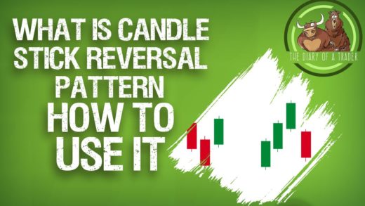
Candlestick reversal patterns are essentially just candles that show signs of exhaustion, or a sudden shift in momentum. In other words, we may have been going higher, but suddenly looks as if we are either running out of momentum to the upside, or than the sellers have come in and absolutely taken over. Either one is reason enough to think that we are going to turn things back around. Of course, the opposite is true as well. For example, we may have been falling rather rapidly but eventually the market bounces in the way during the course of the candle that tells us perhaps the buyers are about to take over again. One of the great things about reversal candles is that they can give you a bit of a “heads up” as to trouble ahead. For example, perhaps you were short of a particular currency pair and it forms what is known as a hammer. The hammer is simply a candle that shows that the sellers ran out of momentum, and ended up reversing quite a bit of the momentum. This often can be the sign of the market turning back around to the upside. So if you are already short, this may give you the idea to either exit the market, or at least move your stop loss is to lower levels. You also have the same thing in an uptrend, we form what is known as a shooting star, which is essentially a market going fairly high, and then dropping back down to form a candle with a very long wick. You can move your stop losses higher. On the other hand, when you see the signals you can start trading in the other direction. It’s a great way to pick up trend changes. There are also what is known as in golfing candles, and they are simply candles that swallow the previous candle in the opposite direction. What I mean by this is that if the market has been falling, and you simply get a very huge green candle, that typically means of the buyers have taken control again. With that being the case, it looks as if it’s time to either exit any short positions that you have, or start buying. Obviously, the exact opposite is true as well.
The Average Directional Index or ADX, is a momentum indicator that you can use trade financial instruments. It comes with 3 lines, two which shows the directional strength of both positive and negative movement, and then the ADX indicator itself. Most traders ignore the other 2 lines, and for the purposes of this video I will focus on the actual indicator line itself. It is the solid green line, and what it measures it is the actual strength of the trend. It is not dependent on whether or not the trend is up or down, just that it has strength. In other words, it rises when the trend strength is strong, and declines when it may be weakening. The weaker the trend, the more likely you are to see consolidation. When traders use the ADX, they are trying to find a real momentum. So in other words, if we get a break out or some other type of buying signal, traders will often use the indicator to see if there’s any real indication of underlying strength. After all, there are such things as “false breakouts”, which are sudden moves that completely reverse themselves. By using this indicator, you can perhaps avoid some of those. Also, it can tell you sometimes when we are starting to run out of steam, and therefore might be time to step away from the trend and close your position.
In this video, I look at calendars and their importance. After all, the economic calendar is very important to pay attention to as various headlines can move currency, commodity, and various other financial markets. There are several calendars out there for use, and in this example I’m using the calendar at Forex Factory, as it is a neutral and free one that anybody can access. When you look at the calendar, there is quite often some type of gauge when it comes to impact. Typically, the events will be color-coded, and as a result it makes it simple to figure out what could move the markets during the day. Because of this, it makes it easy to see what’s more important than others, and more important for specific countries or markets. For example, you don’t want to place money on a currency that is about to get a massive headline coming in a few minutes. At that point, you are simply gambling. When you walk into your trading area, you have to check the calendars in order to figure out what’s coming up for the day, and potential unpleasant surprises that could arise. The last thing you want to do is place a trade right before some type of massive economic surprise that works against you. With this, you can avoid the absolute worst thing that happens to traders: putting a position on and having the market turnaround against you based on some announcement that you could have looked up. After all, if you are not aware of potential market moving events, you’re at the mercy of unseen forces. Although I used Forex Factory in this example, keep in mind that most brokerages offer some type of event calendar.
Recent Comments
Alberto CannApril 19, 2020 at 5:42 pm
thediaryofatraderNovember 26, 2018 at 2:46 am
Forex Steam SettingNovember 26, 2018 at 12:33 am