On the attached EUR/NZD hourly chart, there is quite a bit of volatility. The 123 Trading System is a simple use of a zigzag pattern in pricing to enter the market. This allows traders to stay with the trend, and continue to pick up momentum in the market. The 123 of the system is in reference to 3 points on the chart. The 1 is the initial move, the 2 is the retracement, and the 3 is a confirmation of the initial move. This works in both up and down trends, and it gives you an opportunity to capitalize on a market that continues to move in a specific direction. Needless to say, this is a market that needs a trend to be effective. At the bottom left part of the chart, we had initially rallied from the 1.55 region to the 1.57 level, and then pulled back to the 1.56 level, and eventually broke to a fresh, new high. That’s essentially what we’re doing here: taking advantage of the momentum as an uptrend continues. There are several different ways to trade the strategy, simply entering on a confirmation of the 3, or waiting for another move like that and adding to your position and order to “pyramid” your size to make significant gains over the longer term. This works to the downside as well, essentially firing off a signal every time you make a fresh new low. As for targeting, to make the trade position worth your time, you should at least aim for the height of the pattern the got you involved.
When a market gaps higher or lower at the open, it shows a significant decision made by the trading public overall. This means that there simply weren’t enough people on the other side of the trade to absorb the pressure immediately. Because of this, it shows that an extreme attitude change has either just been had, or perhaps we have shown a confirmation of an overall trend. Gaps are very rare in the Forex market. The typically can only happen on a Monday open, and only after a major of that. However, and other markets they are much more common. For example, stock markets gap quite often, and this gives us an opportunity to make money on momentum. In the attached daily chart of IBM, you can see that there were a couple of significant gaps to the downside. This shows that there were so many people willing to sell this stock that we had to gap lower to find people willing to take the other side of the trade. This shows a significant change in attitude. When you pair these gaps with the 20-day simple moving average, it shows you which direction you should be trading. Quite often, people will sell at the open on a gap, and then put their stop loss on the other side. As far as taking profit, that can be done in almost any way imaginable, as this trade typically will be more of a longer-term deal. As you can see, we have gapped a couple of times since then in IBM, as a continues to unwind. By paying attention to these signs, you can be on the right side of the market. In the stock market, it’s quite common for traders to move their stop losses to the next gap if we get another one, just as we have seen on this chart.
One of the most common patterns that you will see on a training chart is the rectangle. The rectangle is essentially a simple consolidation pattern where you have obvious support and resistance. The markets just grind back and forth before making a decision. Because of this obvious pattern, you have the rest of the market noticing these levels as well. That’s the beauty of this strategy: it’s so obvious that other traders are waiting for the same thing. On the attached AUD/NZD daily chart, you can see that the market had found significant resistance at the 1.0550 level, while having significant support at the 1.0375 handle underneath. Traders simply had to wait for a daily close outside of that rectangle to start going long of the market. Tradition dictates that a traitor will put their stop loss half way into the rectangle that was just broken out of, and as you can see your trade would have been protected. The target is quite often the same height as the rectangle, and since you have a stop loss with only half the distance, you have a build in 2 to 1 ratio.
One of the easiest ways to train the financial markets is to go with the trend. By using the Daily Breakout System, this ensures that you should be with the overall momentum of the marketplace, and it gives you an opportunity to profit off the volatile moves. On the attached chart, I have the AUD/JPY currency pair on the one-hour time frame loaded. As you can see, I have dashed lines via the period separators on the chart. Every time one of those lines is crossed, we go into another trading session. The trading system is simple: you take a break out of the previous days close and follow the market. Preferably, you can go with the longer-term trend, but for some traders, they will take the trade either direction. You can see that I have several rectangles on the chart that show when we would have placed the trade. You simply enter a buy order on a break of the previous day’s high price, or a sell order at the previous day’s low price. You then place a stop loss at 50% of the total session range of the previous day, and hold your position. As far as take profit is concerned, typically people will move stop losses every 24 hours. So, for example, on the session that you entered, you would then put the stop loss at 50% of that move after that day is done, and so on. Eventually, the market will knock you out of your position, telling you when to exit.
One of the simplest strategies that traders will use is a 3-candle strategy. The basis of the strategy is that once 3 candles form in the same direction, momentum is starting to swing accordingly. For example, if we get 3 bullish candles, in theory the bullish momentum is starting to take over. Obviously, the exact opposite is true for bearish candles. One of the most important things to keep in mind is that the higher the timeframe, the more likely there is validity to the signal. On the attached chart, I have a couple of areas that would have been interesting in the CHF/JPY weekly timeframe. The first yellow ellipse features 3 negative candles that have a bit of range to them, meaning that there was significant movement during the week. They were all 3 negative, and you can see led to a move much lower. The second ellipse is the exact opposite. We have 3 bullish candles with the recent range, which led to a move much higher. There are a couple of different ways to play this strategy, but the most common is to place a stop loss at 50% of the range of the 3 candles. This gives the market the ability to pull back slightly, or a bounce, depending on the direction, and then continue the momentum. For example, in the first ellipse you can see that we did in fact bounced slightly, but then continue to fall. On the other hand, the second trade signal didn’t have much in the way of a pullback at all. The target is essentially the same length of a move as the 3 candles used as a signal. 3 consecutive candles with a reasonable range are needed for the signal, as it shows that the market is starting to pick up or lose momentum. While not the most technical of strategies, this strategy does work over the longer-term. In this example, these trades would have lasted several weeks, but certainly you can see that the momentum carried the trader to profit eventually.
The financial markets tend to have average pricing over the longer term. This is quite often looked at as a smoothing mechanism, and deviation from that average can often lead to reversals that are due to exhaustion. This simple trading strategy uses that as a factor as to when to place a trade. On this chart, the silver weekly chart, I have placed the Standard Deviation indicator at the bottom of my Metatrader 4 platform. As you can see, I have one level, the 2.0 level, marked on the indicator at the bottom of the chart. When the green line rises above the 2.0 level, it means that the market is more than twice the distance away from the overall average that it typically is. Using the idea of standard deviation in mathematics, we know that 95% of all statistical averages fall within 2 standard deviations of the mean. That’s exactly what this trading strategy is all about. It’s about markets getting too far ahead of themselves. When you look at this chart, you can also see that I have the 20 Moving Average on the chart, but that’s essentially for illustrative purposes. As you can tell, early in 2013, Silver markets had bounced rather drastically and coinciding with this was an explosion in the standard deviation. In fact, we had reached as high as 3.57, something that is unsustainable. As we had been in a downtrend, the real trade would have been to play the bounce initially, and then on the exhaustive candle as we were still well above standard deviation, to sell. A more patient trader would have simply sold as it went with the overall downtrend. You can play this either way, and you played on all time frames. By selling silver at that point, you’ve seen a gradual decrease in the value of silver and we have stayed within 2 standard deviations since. Watching this indicator can give you an idea of when a significant turnaround is about to happen.
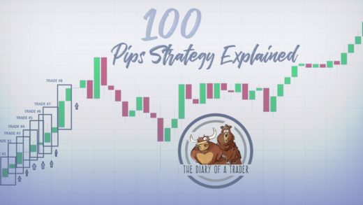
Oddly enough, people seem to be attracted to large, round, psychologically significant numbers. This can break down into several different increments, but for this example we will use 100 pips. Longer-term traders can also look at 500 pips, 250 pips, etc. Looking at the attached USD/CAD hourly chart, you can see that the market does tend to react to large, round, psychologically important numbers such as the 1.27 level, the 1.26 level, and so on. That is exactly what this system exploits: the proclivity of large funds to use large, round, psychologically significant numbers to enter into the market as they have huge amounts of positions to deploy. Also, the options market has a massive effect on how the spot market will move, and that is reflected in the large, round numbers as options are normally priced at them. As you can see, I also have a moving average attached to the chart, and we had an impulsive candle during 1 August that broke above the 1.25 level as the moving average shot higher. That impulsive candle led the market towards the 1.26 level where we pulled back. The trader simply enters the market at the close of the candle, puts a stop loss underneath the large, round, significant number that we have just broken, and the names for the next one. It really is that simple, and if we have any type of trend going, it does work over time.
Trend following can be done in several there are ways, but in this video I am looking at the exponential moving average. The difference between the exponential moving average and a simple moving average is that the exponential moving average puts more emphasis on the most recent candles. So for example, if you have a 50 day moving average, the 50-day exponential version of that moving average calculates the most recent candles as much more important than the first few. In other words, and gives you an idea of momentum shifting rather quickly. On the chart, you can see that the 50 day exponential moving average has been offering a bit of dynamic resistance as of late, so traders would expect sellers to come in every time we approach this moving average. Also, you can clearly see that the moving averages moving downward, which of course indicates a negative trend. By using this moving average, the trader would then be able to place trades in the direction of the larger trend in general. Typically, this is the best way to make money in the markets as you are not finding the market but rather letting it work for you. In reality, there isn’t a huge difference between a simple moving average in an exponential moving average though, because quite frankly the calculation isn’t dramatically different on larger timeframe. However, a shorter-term chart you can often see a significant difference as the moving averages will be reacting much quicker.
Recent Comments
Alberto CannApril 19, 2020 at 5:42 pm
thediaryofatraderNovember 26, 2018 at 2:46 am
Forex Steam SettingNovember 26, 2018 at 12:33 am